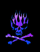
for our Cyberarts class we were tasked to ceate a logo for an imaginary company. We were supposed to create a logo, and a typeface that represented our company. The company I chose was “Razorz Edge Comicz”. Razorz Edge is a very brash, sleek and a bit dangerous. I chose the colours in my typographic logo to be red and black because to me, red emits a tense, raging feeling, and black emits a sleek, cool feeling.
I chose the font “DREAD” because “R.E.C ltd” specializes in dark, gothic comics and artwork. The logo I made incorporates every principal of design except for value, but because it’s supposed to be a 2D logo I think it doesn’t have much relevance. I changed the letters in the logo to incorporate the sharp, “razor” feel to the words. The logo seems to me that it emits a tense, piercing feeling.
I believe my logo is a good one, the type is legible, the actual look of the logo is very distinct, the logo does differentiate my comics from other industries, it’s appropriate for a comic company, it describes the company’s personality, it has a graphic impact, it has balance and unity, it has a good positive and negative relationship, it is a memorable logo, it works well in black and white, and it works well when enlarged and reduced. I really believe that my typographic solution is the best out of the other two. I hope you like my logo.


